Just click on this link and setup a free account for monthly pay out ...it's absolutely free... so don't wait.
http://getmonthlypay.com/index.php?invite=133361
http://getmonthlypay.com/index.php?invite=133361


This blog contains many types of information about Website Design, Development, Management & Analysis Process or Tips... and this is free for Public to speak hare...


 Close Me!
Title
Date


Copy
-

Title
Date
Copy
.main_image {

 width: 598px;

 height: 456px;

 float: left;

 background: #333;

 position: relative;

 overflow: hidden; /*--Overflow hidden allows the description to toggle/tuck away as it slides down--*/

 color: #fff;

}

.main_image h2 {

 font-size: 2em;

 font-weight: normal;

 margin: 0 0 5px;

 padding: 10px;

}

.main_image p {

 font-size: 1.2em;

 line-height: 1.6em;

 padding: 10px;

 margin: 0;

}

.block small { /*--We'll be using this same style on our thumbnail list--*/

 font-size: 1em;

 padding: 0 0 0 20px;

 background: url(icon_calendar.gif) no-repeat 0 center;

}

.main_image .block small {margin-left: 10px;}

.main_image .desc{

 position: absolute;

 bottom: 0;

 left: 0; /*--Stick the desc class to the bottom of our main image container--*/

 width: 100%;

 display: none; /*--Hide description by default, if js is enabled, we will show this--*/

}

.main_image .block{

 width: 100%;

 background: #111;

 border-top: 1px solid #000;

}

.main_image a.collapse { /*--This is our hide/show tab--*/

 background: url(btn_collapse.gif) no-repeat left top;

 height: 27px;

 width: 93px;

 text-indent: -99999px;

 position: absolute;

 top: -27px;

 right: 20px;

}

.main_image a.show {background-position: left bottom;}.image_thumb {
float: left;
width: 299px;
background: #f0f0f0;
border-right: 1px solid #fff;
border-top: 1px solid #ccc;
}
.image_thumb img {
border: 1px solid #ccc;
padding: 5px;
background: #fff;
float: left;
}
.image_thumb ul {
margin: 0;
padding: 0;
list-style: none;
}
.image_thumb ul li{
margin: 0;
padding: 12px 10px;
background: #f0f0f0 url(nav_a.gif) repeat-x;
width: 279px;
float: left;
border-bottom: 1px solid #ccc;
border-top: 1px solid #fff;
border-right: 1px solid #ccc;
}
.image_thumb ul li.hover { /*--Hover State--*/
background: #ddd;
cursor: pointer;
}
.image_thumb ul li.active { /*--Active State--*/
background: #fff;
cursor: default;
}
html .image_thumb ul li h2 {
font-size: 1.5em;
margin: 5px 0;
padding: 0;
}
.image_thumb ul li .block {
float: left;
margin-left: 10px;
padding: 0;
width: 170px;
}
.image_thumb ul li p{display: none;}/*--Hide the description on the list items--*/
$(".main_image .desc").show(); //Show Banner

$(".main_image .block").animate({ opacity: 0.85 }, 1 ); //Set Opacity$(".image_thumb ul li:first").addClass('active'); //Add the active class (highlights the very first list item by default)
$(".image_thumb ul li").click(function(){
//Set Variables
var imgAlt = $(this).find('img').attr("alt"); //Get Alt Tag of Image
var imgTitle = $(this).find('a').attr("href"); //Get Main Image URL
var imgDesc = $(this).find('.block').html(); //Get HTML of the "block" container
var imgDescHeight = $(".main_image").find('.block').height(); //Find the height of the "block"
 if ($(this).is(".active")) {  //If the list item is active/selected, then...

  return false; // Don't click through - Prevents repetitive animations on active/selected list-item

 } else { //If not active then...

  //Animate the Description

  $(".main_image .block").animate({ opacity: 0, marginBottom:
-imgDescHeight }, 250 , function() { //Pull the block down (negative
bottom margin of its own height)

   $(".main_image .block").html(imgDesc).animate({ opacity: 0.85,
marginBottom: "0" }, 250 ); //swap the html of the block, then pull the
block container back up and set opacity

   $(".main_image img").attr({ src: imgTitle , alt: imgAlt}); //Switch the main image (URL + alt tag)

  });

 }

 //Show active list-item

 $(".image_thumb ul li").removeClass('active'); //Remove class of 'active' on all list-items

 $(this).addClass('active');  //Add class of 'active' on the selected list

 return false;
}) .hover(function(){ //Hover effects on list-item

 $(this).addClass('hover'); //Add class "hover" on hover

 }, function() {

 $(this).removeClass('hover'); //Remove class "hover" on hover out

});
$("a.collapse").click(function(){

 $(".main_banner .block").slideToggle(); //Toggle the description (slide up and down)

 $("a.collapse").toggleClass("show"); //Toggle the class name of "show" (the hide/show tab)

});<canvas>; and, eventually, WebGL. Finally, we meagre front-end developers have our own three-dimensional jewel: CSS 3-D transforms! Flipping from details view to options view via a 3-D transition
Transform and roll out.Let’s get coding.
transform property, with the perspective as a functional notation:-webkit-transform: perspective(600);
perspective property: -webkit-perspective: 600;
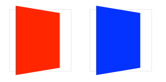 The red element on the left uses
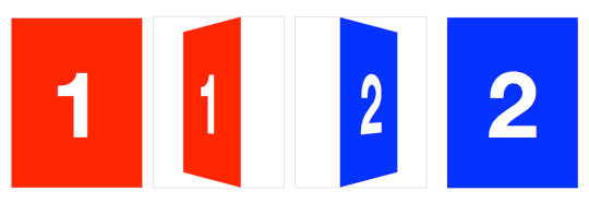
 transform: perspective() functional notation; the blue element on the right uses the perspective propertyrotateY transform). But when used on multiple elements, the transformed elements don’t line up as expected. If you use the same transform across elements with different positions, each element will have its own vanishing point. To remedy this, use the perspective property on a parent element, so each child shares the same 3-D space.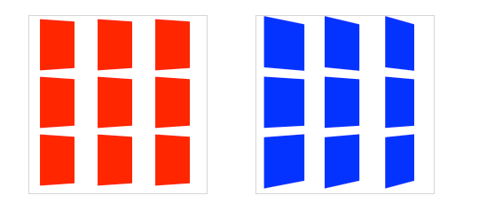 Each
red box on the left has its own vanishing point within the parent
container; the blue boxes on the right share the vanishing point of the
parent container
Each
red box on the left has its own vanishing point within the parent
container; the blue boxes on the right share the vanishing point of the
parent containerperspective determines the intensity of
the 3-D effect. Think of it as a distance from the viewer to the object.
The greater the value, the further the distance, so the less intense
the visual effect. perspective: 2000; yields a subtle 3-D effect, as if we were viewing an object from far away. perspective: 100; produces a tremendous 3-D effect, like a tiny insect viewing a massive object.perspective-origin property.-webkit-perspective-origin: 25% 75%;
perspective, we can now transform elements in all three glorious spatial dimensions, including the third Z dimension, depth. transform property used for 2-D transforms. If you’re familiar with 2-D transforms, you’ll find the basic 3D transform functions fairly similar. rotateX(angle)rotateY(angle)rotateZ(angle)translateZ(tz)scaleZ(sz)translateX() positions an element along the horizontal X-axis, translateZ()
positions it along the Z-axis, which runs front to back in 3-D space.
Positive values position the element closer to the viewer, negative
values further away.rotate functions rotate the element around the
corresponding axis. This is somewhat counter-intuitive at first, as you
might imagine that rotateX will spin an object left to right. Instead, using rotateX(45deg) rotates an element around the horizontal X-axis, so the top of the element angles back and away, and the bottom gets closer to the viewer.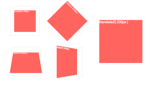 3-D
3-D rotate() and translate() functions around each axistransform functions that require values for all three dimensions:translate3d(tx,ty,tz)scale3d(sx,sy,sz)rotate3d(rx,ry,rz,angle)foo3d() transform functions also have the benefit of triggering hardware acceleration in Safari. Dean Jackson, CSS 3-D transform spec author and main WebKit dude, writes (to Thomas Fuchs):In essence, any transform that has a 3D operation as one of its functions will trigger hardware compositing, even when the actual transform is 2D, or not doing anything at all (such asFor the sake of simplicity, my demos will use the basic transform functions, but if you’re writing production-ready CSS for iOS or Safari-only, make sure to use thetranslate3d(0,0,0)). Note this is just current behaviour, and could change in the future (which is why we don’t document or encourage it). But it is very helpful in some situations and can significantly improve redraw performance.
foo3d() functions to get the best rendering performance.<section class="container">
<div id="card">
<figure class="front">1</figure>
<figure class="back">2</figure>
</div>
</section>
.container will house the 3-D space. The #card acts as a wrapper for the 3-D object. Each face of the card has a separate element: .front; and .back.
Even for such a simple object, I recommend using this same pattern for
any 3-D transform. Keeping the 3-D space element and the object
element(s) separate establishes a pattern that is simple to understand
and easier to style.perspective to the parent 3-D space, along with any size or positioning styles..container {
width: 200px;
height: 260px;
position: relative;
-webkit-perspective: 800;
}
#card element can be transformed in its
parent’s 3-D space. We’re combining absolute and relative positioning so
the 3-D object is removed from the flow of the document. We’ll also add
width: 100%; and height: 100%;. This ensures the object’s transform-origin will occur in the centre of .container. More on transform-origin later. #card {
width: 100%;
height: 100%;
position: absolute;
-webkit-transform-style: preserve-3d;
-webkit-transition: -webkit-transform 1s;
}
.container’s perspective only applies to direct descendant children, in this case #card.
In order for subsequent children to inherit a parent’s perspective, and
live in the same 3-D space, the parent can pass along its perspective
with transform-style: preserve-3d. Without 3-D transform-style, the faces of the card would be flattened with its parents and the back face’s rotation would be nullified. position: absolute. In order to hide the reverse sides of the faces when they are faced away from the viewer, we use backface-visibility: hidden. #card figure {
display: block;
position: absolute;
width: 100%;
height: 100%;
-webkit-backface-visibility: hidden;
}
.back face, we add a basic 3-D transform of rotateY(180deg). #card .front {
background: red;
}
#card .back {
background: blue;
-webkit-transform: rotateY(180deg);
}
#card requires a corresponding style for when it is flipped.#card.flipped {
-webkit-transform: rotateY(180deg);
}
flipped class. When .flipped, the #card will rotate 180 degrees, thus exposing the .back face.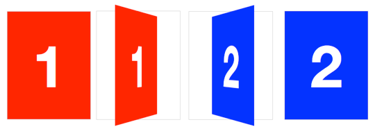 Flipping a card in three dimensions
transform-origin of an element is at its horizontal and vertical centre (50% 50% or center center). Let’s change it to the right side:#card { -webkit-transform-origin: right center; }
translateX. We’ll set the rotation to -180deg so it flips right side out.#card.flipped {
-webkit-transform: translateX(-100%) rotateY(-180deg);
}
 Creating a slide-flip from the right edge of the card
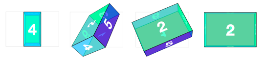
<section class="container">
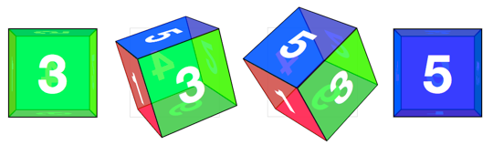
<div id="cube">
<figure class="front">1</figure>
<figure class="back">2</figure>
<figure class="right">3</figure>
<figure class="left">4</figure>
<figure class="top">5</figure>
<figure class="bottom">6</figure>
</div>
</section>
.container {
  width: 200px;
  height: 200px;
  position: relative;
  -webkit-perspective: 1000;
}
#cube {
  width: 100%;
  height: 100%;
  position: absolute;
  -webkit-transform-style: preserve-3d;
}
#cube figure {
  width: 196px;
  height: 196px;
  display: block;
  position: absolute;
  border: 2px solid black;
}
#cube .front { -webkit-transform: rotateY(0deg); }
#cube .back { -webkit-transform: rotateX(180deg); }
#cube .right { -webkit-transform: rotateY(90deg); }
#cube .left { -webkit-transform: rotateY(-90deg); }
#cube .top { -webkit-transform: rotateX(90deg); }
#cube .bottom { -webkit-transform: rotateX(-90deg); }
#cube .front style declaration, as this transform has no effect, but let’s leave it in to keep our code consistent.100px.#cube .front { -webkit-transform: rotateY(0deg) translateZ(100px); }
#cube .back { -webkit-transform: rotateX(180deg) translateZ(100px); }
#cube .right { -webkit-transform: rotateY(90deg) translateZ(100px); }
#cube .left { -webkit-transform: rotateY(-90deg) translateZ(100px); }
#cube .top { -webkit-transform: rotateX(90deg) translateZ(100px); }
#cube .bottom { -webkit-transform: rotateX(-90deg) translateZ(100px); }
translateZ function comes after the rotate.
The order of transform functions is important. Take a moment and soak
this up. Each face is first rotated towards its position, then
translated outward in a separate vector.
transform-origin may be, the panel number 1 always returns to its original position, as if all those funky 3-D transforms didn’t even matter.#cube, we can push the 3-D object back, so that the front face will be positioned back to the Z-axis origin.#cube { -webkit-transform: translateZ(-100px); }
 Restoring the front face to the original position on the Z-axis
#box to apply the appropriate transform.#cube.show-front { -webkit-transform: translateZ(-100px) rotateY(0deg); }
#cube.show-back { -webkit-transform: translateZ(-100px) rotateX(-180deg); }
#cube.show-right { -webkit-transform: translateZ(-100px) rotateY(-90deg); }
#cube.show-left { -webkit-transform: translateZ(-100px) rotateY(90deg); }
#cube.show-top { -webkit-transform: translateZ(-100px) rotateX(-90deg); }
#cube.show-bottom { -webkit-transform: translateZ(-100px) rotateX(90deg); }
translateZ, then we rotate it.transition to animate the rotation between states. #cube { -webkit-transition: -webkit-transform 1s; }
 Rotating the cube with a CSS
 transition#cube, but we’ll switch the cube id for #box. The container styles remain mostly the same:.container {
width: 300px;
height: 200px;
position: relative;
-webkit-perspective: 1000;
}
#box {
width: 100%;
height: 100%;
position: absolute;
-webkit-transform-style: preserve-3d;
}
left: 100px ((300 − 100) ÷ 2), The stouter top and bottom faces get positioned top: 50px ((200 − 100) ÷ 2).#box figure {
display: block;
position: absolute;
border: 2px solid black;
}
#box .front,
#box .back {
width: 296px;
height: 196px;
}
#box .right,
#box .left {
width: 96px;
height: 196px;
left: 100px;
}
#box .top,
#box .bottom {
width: 296px;
height: 96px;
top: 50px;
}
#box
is 100 pixels deep. The translate value for the left and right faces is
150 pixels for their 300 pixels width. Top and bottom panels take 100
pixels for their 200 pixels height:#box .front { -webkit-transform: rotateY(0deg) translateZ(50px); }
#box .back { -webkit-transform: rotateX(180deg) translateZ(50px); }
#box .right { -webkit-transform: rotateY(90deg) translateZ(150px); }
#box .left { -webkit-transform: rotateY(-90deg) translateZ(150px); }
#box .top { -webkit-transform: rotateX(90deg) translateZ(100px); }
#box .bottom { -webkit-transform: rotateX(-90deg) translateZ(100px); }
#box needs to have a style to reverse that face’s transform. Both the translateZ and rotate values are the opposites of the corresponding face.#box.show-front { -webkit-transform: translateZ(-50px) rotateY(0deg); }
#box.show-back { -webkit-transform: translateZ(-50px) rotateX(-180deg); }
#box.show-right { -webkit-transform: translateZ(-150px) rotateY(-90deg); }
#box.show-left { -webkit-transform: translateZ(-150px) rotateY(90deg); }
#box.show-top { -webkit-transform: translateZ(-100px) rotateX(-90deg); }
#box.show-bottom { -webkit-transform: translateZ(-100px) rotateX(90deg); }
 Rotating the rectangular box with a CSS
 transition<div class="container">
<div id="carousel">
<figure>1</figure>
<figure>2</figure>
<figure>3</figure>
<figure>4</figure>
<figure>5</figure>
<figure>6</figure>
<figure>7</figure>
<figure>8</figure>
<figure>9</figure>
</div>
</div>
#carousel 20 pixel gaps between one another, done here with left: 10px; and top: 10px;. The effective width of each panel is 210 pixels..container {
width: 210px;
height: 140px;
position: relative;
-webkit-perspective: 1000;
}
#carousel {
width: 100%;
height: 100%;
position: absolute;
-webkit-transform-style: preserve-3d;
}
#carousel figure {
display: block;
position: absolute;
width: 186px;
height: 116px;
left: 10px;
top: 10px;
border: 2px solid black;
}
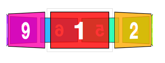
#carousel has nine
panels. If each panel gets an equal distribution on the carousel, each
panel would be rotated forty degrees from its neighbour (360 ÷ 9).#carousel figure:nth-child(1) { -webkit-transform: rotateY(0deg); }
#carousel figure:nth-child(2) { -webkit-transform: rotateY(40deg); }
#carousel figure:nth-child(3) { -webkit-transform: rotateY(80deg); }
#carousel figure:nth-child(4) { -webkit-transform: rotateY(120deg); }
#carousel figure:nth-child(5) { -webkit-transform: rotateY(160deg); }
#carousel figure:nth-child(6) { -webkit-transform: rotateY(200deg); }
#carousel figure:nth-child(7) { -webkit-transform: rotateY(240deg); }
#carousel figure:nth-child(8) { -webkit-transform: rotateY(280deg); }
#carousel figure:nth-child(9) { -webkit-transform: rotateY(320deg); }
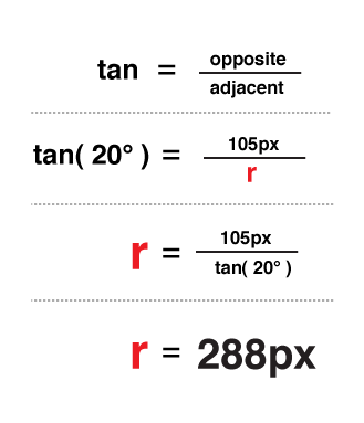
translate
value was simple to calculate, as it was equal to one half the width,
height or depth of the object. With this carousel, there is no size we
can automatically use as a reference. We’ll have to calculate the
distance of the shift by other means.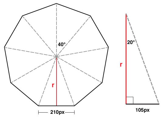
#carousel figure:nth-child(1) { -webkit-transform: rotateY(0deg) translateZ(288px); }
#carousel figure:nth-child(2) { -webkit-transform: rotateY(40deg) translateZ(288px); }
#carousel figure:nth-child(3) { -webkit-transform: rotateY(80deg) translateZ(288px); }
#carousel figure:nth-child(4) { -webkit-transform: rotateY(120deg) translateZ(288px); }
#carousel figure:nth-child(5) { -webkit-transform: rotateY(160deg) translateZ(288px); }
#carousel figure:nth-child(6) { -webkit-transform: rotateY(200deg) translateZ(288px); }
#carousel figure:nth-child(7) { -webkit-transform: rotateY(240deg) translateZ(288px); }
#carousel figure:nth-child(8) { -webkit-transform: rotateY(280deg) translateZ(288px); }
#carousel figure:nth-child(9) { -webkit-transform: rotateY(320deg) translateZ(288px); }
translateZ value. In JavaScript terms, that equation would be:var tz = Math.round( ( panelSize / 2 ) /
Math.tan( ( ( Math.PI * 2 ) / numberOfPanels ) / 2 ) );
// or simplified to
var tz = Math.round( ( panelSize / 2 ) /
Math.tan( Math.PI / numberOfPanels ) );
-webkit-transform: translateZ(-288px) rotateY(-160deg);
border-radius, box-shadow
and background gradients, now have an incredible tool at our disposal
in 3-D transforms. They deserve just the same enthusiasm, research and
experimentation we have seen on other CSS3 features. Now is the perfect
time to take the plunge and start thinking about how to use three
dimensions to elevate our craft. I’m breathless waiting for what’s to
come. 
<input type="number"><input type="number" … >
number input type.<input type="range">range input type:<input type="range" … >
range input type.<output onforminput="value=weight.value"></output><input type="date"> and other date/time controls<input type="date" … >
<input type="time" … >step attribute specified) that only allows you to input a time value.
date and time input types.datetime: combines the functionality of two we have looked at above, allowing you to choose a date and a timemonth: allows you to choose a month, stored internally
as a number between 1-12, although different browsers may provide you
with more elaborate choosing mechanisms, like a scrolling list of the
month namesweek: allows you to choose a week, stored internally in
the format 2010-W37 (week 37 of the year 2010), and chosen using a
similar datepicker to the ones we have seen already<input type="color">
color input, and the native color pickers on Windows and OS X.<input type="search">search input type is arguably nothing more than a
differently-styled text input. Browsers are meant to style these inputs
the same way as any OS-specific search functionality. Beyond this purely
aesthetic consideration, though, it's still important to note that
marking up search fields explicitly opens up the possibility for
browsers, assistive technologies or automated crawlers to do something
clever with these inputs in the future – for instance, a browser could
conceivably offer the user a choice to automatically create a custom
search for a specific site.
search input as it appears in Opera on OS X.<datalist> element and list attribute<select> and <option>
elements to create dropdown lists of options for our users to choose
from. But what if we wanted to create a list that allowed users to
choose from a list of suggested options, as well as being able to type
in their own? That required fiddly scripting – but now you can simply
use the list attribute to connect an ordinary input to a list of options, defined inside a <datalist> element.<input type="text" list="mydata" … >
<datalist id="mydata">
<option label="Mr" value="Mister">
<option label="Mrs" value="Mistress">
<option label="Ms" value="Miss">
</datalist>
datalist.<input type="tel">, <input type="email"> and <input type="url">placeholderplaceholder attribute:<input type="text"… placeholder="John Doe">
placeholder text.autofocusautofocus attribute:<input type="text" autofocus … >autofocus
form control on a single page. You should also use this sort of
functionality with caution, in situations where a form represents the
main area of interest in a page. A search page is a good example –
provided that there isn't a lot of content and explanatory text, it
makes sense to set the focus automatically to the text input of the
search form.min and maxrange inputs, min and max
are actually necessary to define what values are returned when the
form is submitted. The code is pretty simple and self-explanatory:<input type="number" … min="1" max="10">stepstep attribute can be used with a numerical input
value to dictate how granular the values you can input are. For example,
you might want users to enter a particular time, but only in 30 minute
increments. In this case, we can use the step attribute, keeping in mind that for time inputs the value of the attribute is in seconds:<input type="time" … step="1800"><output>output element when talking about the range input – this element serves as a way to display the result of a calculation, or more generally to provide an explicitly identified output of a script (rather than simply pushing some text into in a random
span or div with innerHTML, for instance). To make it even more explicit what particular form controls the output relates to, we can – in a similar way to label – pass a list of IDs in the element's optional for attribute.
<input type="range" id="rangeexample" … >
<output onforminput="value=rangeexample.value" for="rangeexample"></output>
<progress> and <meter>progress is meant
to represent a progress bar, to indicate the percentage of completion of
a particular task, while meter is a more generic indicator of a scalar
measurement or fractional value.
type, or any
upper/lower bounds set on numerical values, dates and times), they can
also offer native form validation – another tedious task that, up to
now, required authors to write reams of JavaScript or use some
ready-made validation script/library.name attribute, as without it they wouldn't be submitted as part of the form anyway.requiredrequired attribute to an input, select or textarea element.<input type="text" … required>
type and pattern
email input.pattern attribute to specify their own custom regular expression.<input type="text" … pattern="[a-z]{3}[0-9]{3}">
:required and :optional let us explicitly style controls based on whether or not they have a required attribute:valid and :invalid will apply styles to form controls subject to client-side validation:in-range and :out-of-range specifically works with controls that feature a min and/or max attributeinput[type=text]:focus:valid,
input[type=email]:focus:valid,
input[type=number]:focus:in-range { outline: 2px #0f0 solid; }
input[type=text]:focus:invalid,
input[type=email]:focus:invalid,
input[type=number]:focus:out-of-range { outline: 2px #f00 solid; }
:valid and :invalid styles being applied dynamically as an email address is entered.date or number)
will simply fall back to treating them as standard text inputs – not as
user-friendly as their advanced HTML5 counterparts, but at the very
least they allow for a form to be filled in. However, as with most of
the new HTML5 functionalities, we can offer a nicer fallback for users
of browsers that aren't quite up to speed with HTML5 forms by doing
basic JavaScript-based feature-detection and, only if needed, proceed to
load external JavaScript libraries to “fake” the support for more
complex form control widgets and validation. This way, we can code for
the future, while not alienating any of our users.


